
How Surface Pattern Designers Build a Cohesive Collection
Anastasiia MarmyzovaThere is a moment in almost every creative project where a single design stops feeling like “just a pattern” and starts asking for a world around it.
At least that is how it happens for me.
A lot of people imagine the process works the other way around: that surface pattern designers sit down with a perfectly planned roadmap, choose a theme, define every coordinate print in advance, and execute it all neatly from start to finish.
Sometimes that happens.
But very often, especially for independent artists (and especially for neurodivergent ones), collections grow more organically than that. One design leads to another. A color palette starts revealing its emotional direction. A motif repeats itself because it clearly still has something to say.
For me personally, a collection is a blend of story, experience, and a certain feeling I want to convey. And it usually starts with one design sparking the whole thing.
And to be frank, learning to recognize that process changed everything for me.
A collection is not just “matching patterns”
One of the biggest misconceptions about surface pattern collections is that everything needs to look identical to feel cohesive. But cohesion is more about the relationship between individual designs.
A strong collection feels like the patterns belong in the same emotional world, even when they serve different purposes. Some prints are loud. Some are quiet. Some carry the story, while others support it.
Think of it like music:
you need the melody, but you also need rhythm, pauses, softer notes, and grounding elements.

In surface pattern design, that often means balancing:
- hero prints
- secondary prints
- blender or coordinate patterns
- scale variation
- color consistency
- motif repetition
The goal is harmony.
Where collections usually begin for me
Most of my collections start with a single emotional idea rather than a product strategy.
Sometimes it is a feeling. Sometimes it is a memory.
Sometimes it is simply a palette that speaks to me.
For example, with my recent Moonlit Grove mini collection, the shift happened entirely because of color. Originally, the designs leaned earthy and woodland-inspired. Soft greens, warm neutrals, daytime calm.
But the moment I shifted toward deeper teals and moonlit blues, the entire emotional atmosphere changed. Suddenly the collection was no longer about a forest during the day. It became a magical nighttime world filled with fairies, moths, stars, and quiet wonder.
The role of hero prints and supporting patterns
Usually, every collection has one design that carries the emotional weight of the story. That is the hero print.
It is often more detailed, more complex, and visually richer than the rest of the collection. It introduces the main motifs, characters, or narrative direction.
But a collection cannot survive on hero prints alone. Supporting patterns are what make the collection usable (and they are the ones that usually sell the best).
For example:
- a detailed floral might pair with a subtle vine coordinate
- a character print might need a soft star scatter
- a bold geometric could be balanced with tonal texture
This is especially important in licensing and fabric design because manufacturers, quilters, sewists, and product designers need variation.
A nursery fabric collection might include:
- one statement print
- one conversational print
- a botanical coordinate
- a tiny blender
- a simple geometric or texture
Together, they create flexibility.
And flexibility is what turns artwork into a usable collection.
Repeating motifs create familiarity
One of the easiest ways to create cohesion is through repeated visual language.
That could mean:
- recurring leaves
- similar brush textures
- shared shapes
- repeated stars, moons, shells, or florals
- consistent line quality
- recognizable watercolor textures
Even subtle repetition helps the eye understand: “These designs belong together.”
Recently, while building collections from my Spoonflower challenge entries, I noticed this happening naturally.
My seashell mandala designs slowly evolved into geometric explorations using the same shell shapes in different arrangements, while my nursery patterns kept returning to soft botanicals, dreamy palettes, and gentle storytelling.

I don't force a style. I simply know my visual language. And I think that understanding is a much more sustainable way to build a body of work.
Color is often the glue
You can have completely different motifs, but if the palette feels connected, the collection usually will too.
Color creates emotional continuity faster than almost anything else. A limited palette also helps prevent collections from feeling chaotic or overcrowded.
Sometimes I build a collection around:
- one dominant color
- one emotional contrast
- or one grounding neutral
In watercolor work especially, keeping colors slightly muted or tonally connected helps everything feel softer and more cohesive. And interestingly, this is also where many collections begin to reveal their licensing potential.
A manufacturer might not need every print individually. But they do need a cohesive visual family. That is what makes collections valuable.

Collections are often built over time, not all at once
This part was not something I thought of when I first started licensing work. Many collections are not born in a single week. Sometimes they are assembled slowly across months or even years.
A Spoonflower challenge entry becomes a hero print.
A discarded sketch becomes a blender.
An older motif suddenly fits perfectly once the palette evolves.
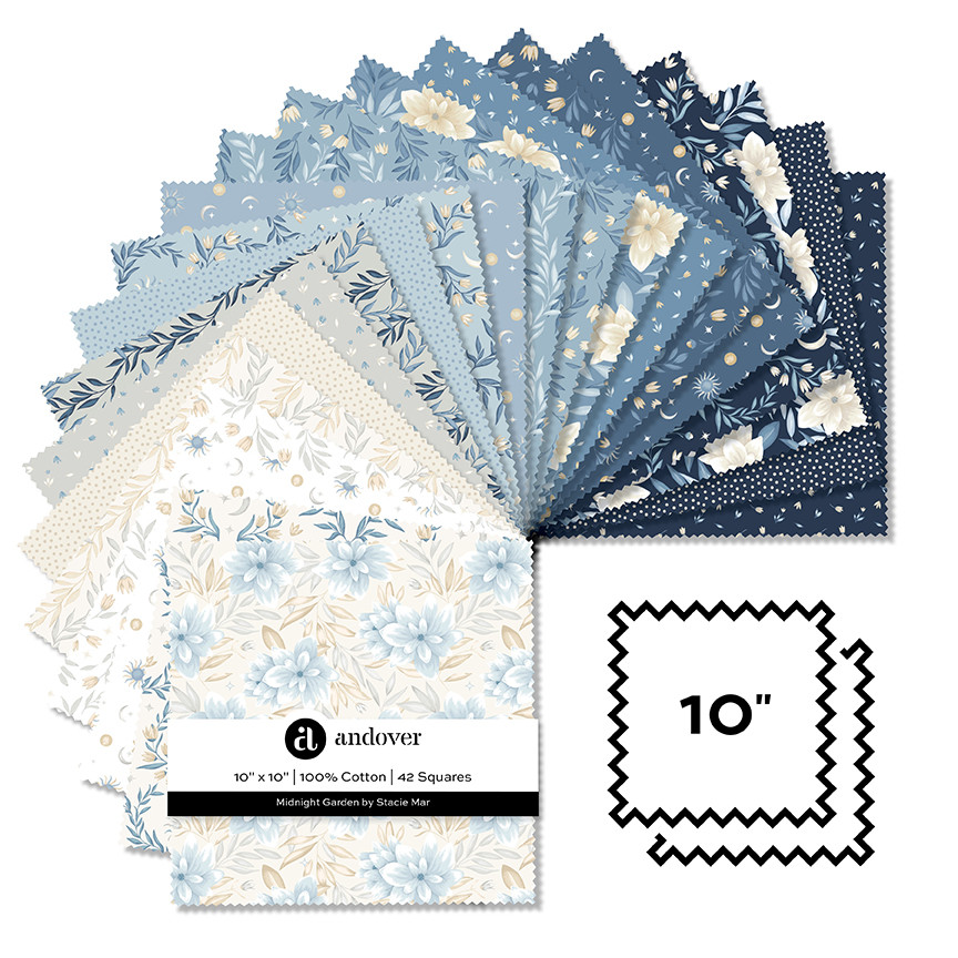
I do this all the time. Genuinely, ALL THE TIME. I still use the elements, textures, or the whole watercolor drawings I created years ago. For example, my hero pattern for the Midnight Garden (licensed in 2025) was created based on the watercolor painting I made in June 2023. It was one of the first ones I made after more than a year of forced hiatus.

What I'm trying to say is that everything becomes part of a larger ecosystem. Instead of constantly chasing brand-new ideas, I keep going back to what I already created, asking:
- “What world does this belong to?”
- “What else wants to exist beside it?”
That question creates much stronger collections than trying to invent everything from scratch every single time. But to be clear, I do create new designs consistently. Some are drawn from scratch, some are inspired by old drawings, and some use existing elements or motifs in a new way.
Building collections slowly is still building
I think many creatives feel pressure to create large polished collections quickly. But cohesive work often comes from allowing ideas to mature.
Sometimes the strongest thing you can do as a designer is return to your existing work with fresh eyes.
Recolor it.
Expand it.
Refine it.
Let it evolve.
That is not cheating the process. That is the process.
I think the collections people connect with most are rarely the ones built from pressure. They are the ones built from curiosity, attention, and emotional clarity. The ones where the artist trusted the world they were already creating.

A cohesive collection is about resonance,creating patterns that feel like they belong together emotionally, visually, and energetically. And sometimes the collection already exists in fragments long before you recognize it.
You just have to slow down enough to notice the connections. Because often, what feels like “random designs” is actually your artistic voice quietly repeating itself, asking you to build a world around it.
